

Unified Toolbar
Overview
This is a significant user experience improvement initiative aimed at upgrading Tachybase's editing mode to a modern WYSIWYG (What You See Is What You Get) editing mode similar to collaborative tools like Lark/Feishu, providing a consistent operation entry point and better interaction experience through a unified toolbar.
Current Pain Points
The current editing mode has the following issues:
- Scattered Operations: Toolbar, initializer, and settings functions are dispersed across different locations, increasing the learning curve for users
- UI Intrusiveness: Editing operations often interfere with the block's UI display, affecting user experience
- Inconvenient Layout Adjustment: Lacks intuitive drag-and-drop layout capabilities; adjusting page structure requires multiple operations
- Separation of Editing and Preview: Users find it difficult to intuitively see the final result during the editing process
Improvement Plan
Core Design Philosophy
Adopt a non-intrusive editing design philosophy, where editing functionality serves content rather than interfering with content display.
Key Features
1. Unified Block Toolbar
Provide a unified toolbar above each block, integrating the original three functional modules and expanding with more practical features:
Toolbar Features Include:
- Block Title: Directly editable block name, click to modify
- Toolbar: Provides quick action buttons like copy, delete, move, etc.
- Initializer: Quickly add new content blocks or components
- Settings: Configure various properties and parameters of the current block
- Debug Tools: Developer assistance features like viewing Schema, logs, etc.
- More Actions: Access additional functions through dropdown menu
Visual Design:
The UI team has established complete visual specifications with a modern design style for the toolbar:
- Hover Activation: Toolbar displays when mouse hovers over the block
- Semi-transparent Background: Toolbar uses subtle transparency to reduce visual interference
- Icon-based Design: All operations represented with intuitive icons
- Responsive Layout: Automatically adjusts toolbar display based on block width
Advantages:
- Unified Operation Entry: All editing operations (including drag, configuration, debugging, etc.) centralized in the toolbar, providing a consistent interaction experience
- Non-blocking UI Display: Toolbar positioned outside the block, not interfering with original content display
- Context-Aware: Dynamically displays relevant functions based on block type
- Professional Visual Design: Enhances overall quality and usability
2. Integrated Drag Capability in Toolbar
The existing drag functionality is now unified into the toolbar, operated through toolbar buttons:
- Drag to Move: Click the drag icon in the toolbar to activate drag mode for adjusting block position
- Drag to Resize: Use the resize button in the toolbar for precise control of block size
- Visual Feedback: Provide clear drag preview and drop zone indicators
This design integrates drag capabilities into the unified toolbar, making all editing operations have a consistent entry point, reducing user cognitive load.
3. Non-Intrusive Editing
Design Principles:
- Floating Display: Toolbar only appears on hover or selection, hidden otherwise
- Minimal Interference: Toolbar uses semi-transparent design, not blocking key content
- Maintain Original Appearance: In edit mode, block content is exactly as final display
- Quick Toggle: Provide shortcuts to quickly enter/exit edit mode
Compact Toolbar for Internal Fields:
For individual fields and components within blocks, a more streamlined compact toolbar design is adopted:
Compact Toolbar Characteristics:
- Maximum 2 Icons Displayed: Only show the most commonly used operations (e.g., copy, delete)
- More Actions Dropdown Menu: Click "More" icon (⋮) to expand full operation list
- Context-Aware: Dynamically displays most relevant operations based on field type
- Lightweight Design: Minimal space footprint, reducing interference with original UI to the minimum
Actual Interface Example:
The image below shows the actual form editing interface, where you can see:
- The unified toolbar at the top contains the block title and various action icons
- Each field has a compact toolbar on the right showing the most commonly used action icons
- The interface is clean and clear, with editing tools not interfering with content display
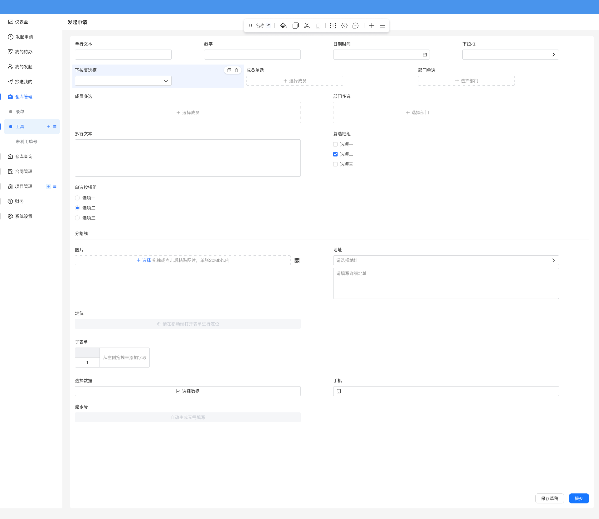
This design ensures complete editing functionality while maximizing the simplicity of the original interface.
4. WYSIWYG Editing Experience
Reference modern editors like Lark, Notion for interaction:
- Real-time Preview: Any modification is immediately reflected in the interface
- Inline Editing: Edit directly on content, no modal dialogs needed
- Smart Suggestions: Provide intelligent suggestions and auto-completion during input
- Quick Formatting: Support Markdown shortcuts and rich text toolbar
Technical Implementation Points
Frontend Architecture
-
Component-based Design
- Abstract unified
CardToolbarcomponent - Implement pluggable toolbar plugin system
- Provide standardized toolbar API
- Abstract unified
-
Drag System
- Based on HTML5 Drag and Drop API
- Implement unified drag event management
- Provide global Store for drag state
-
UI Schema Enhancement
- Extend Schema protocol to support new editing mode
- Maintain backward compatibility
- Provide migration tools to assist upgrades
Interface Design Requirements
The interface design for the unified toolbar will focus on three core objectives, with specific interface definitions to be determined during the implementation phase:
1. Define New Unified Interface
Objective: Provide developers with a simple and easy-to-use new interface to reduce integration costs.
Requirements:
- Provide a unified toolbar item registration mechanism
- Support flexible toolbar configuration and extension
- Provide clear API design, including registration, configuration, and control functions
- Support common features like visibility control, disabled state, and priority sorting
- Provide context-aware capabilities to dynamically display relevant functions based on block type
2. Maintain Backward Compatibility
Objective: Ensure zero migration cost for existing logic, smooth transition to the new unified toolbar.
Requirements:
- No Code Modification Required: Existing code using
SchemaToolbar,SchemaInitializer,SchemaSettingsrequires no modifications - Automatic Adaptation Mechanism: System automatically recognizes and adapts original configurations to the new toolbar
- Complete Feature Preservation: All original features are fully preserved in the new toolbar without losing any capabilities
- Progressive Upgrade Path: Developers can choose the right time to gradually migrate to the new interface, no mandatory requirements
- Dual-mode Coexistence: During the transition period, new and old interfaces can be used simultaneously without interference
3. Optimize Cloud Component Integration Experience
Objective: Simplify the cloud component integration process and provide better development experience.
Requirements:
- Zero-config Integration: Cloud components can automatically appear in the toolbar through simple configuration
- Hot Reload Support: Toolbar automatically refreshes after cloud component updates without restarting the application
- Unified Management Mechanism: Cloud component toolbar items use the same management mechanism as local components
- Version Compatibility Handling: Automatically handles interface differences between different cloud component versions
- One-click Registration: Provide convenient registration methods to reduce configuration code
4. Developer Tool Support
To help developers better use the new interface, supporting development tools will be provided:
Migration Tools:
- Automatically analyze existing code and identify old interface usage
- Generate migration suggestions and new interface code
- Provide detailed migration guides and best practices
- Preserve original code as comments for comparison and rollback
Documentation and Examples:
- Provide complete API documentation
- Provide rich usage examples and best practices
- Provide migration guides from old to new interfaces
Interaction Optimization
-
Performance Optimization
- Use virtual scrolling for handling large number of blocks
- Implement lazy loading for toolbar
- Optimize rendering performance during drag operations
-
Accessibility
- Support keyboard shortcuts
- Provide screen reader support
- Ensure color contrast meets standards
Expected Benefits
User Experience Improvement
- More Consistent Operation Entry: All editing functions unified in the toolbar, providing a consistent interaction experience
- Better Interaction Experience: Aligned with modern editor usage habits, intuitive and easy to use
- Non-blocking Original UI Display: Non-intrusive design lets users focus on content itself, editing tools do not interfere with interface presentation
Developer Friendly
- Simplified Concept Understanding: No need to understand multiple scattered concepts like Toolbar, Initializer, Settings, only need to understand the unified toolbar
- Unified API: Provides simple and easy-to-use new interface, simplifies plugin development, reduces extension difficulty
- Zero Migration Cost: Existing logic requires no modification, automatically adapts to new toolbar, fully backward compatible
- Better Maintainability: Modular functionality, easy for future iterations
- Cloud Component Friendly: Optimized cloud component integration experience, zero-config integration, supports hot reload
- Standardized Interfaces: Promote ecosystem development, encourage community contributions
Product Competitiveness
- Benchmark First-class Products: Editing experience aligned with Notion, Lark, etc.
- Differentiation Advantage: Combined with Tachybase's flexibility, provide more powerful customization capabilities
- Attract New Users: Modern editing experience lowers user migration barriers
Compatibility Notes
To ensure a smooth transition, we will:
- Maintain Backward Compatibility: Existing editing modes remain available
- Progressive Migration: Provide migration tools and detailed documentation
- Configuration Options: Allow users to switch between new and old modes
- Thorough Testing: Ensure no impact on existing functionality
Reference Cases
- Lark/Feishu Docs: Inline editing, drag layout
- Notion: Block-level editing, unified toolbar
- Yuque: WYSIWYG, quick operations
- Craft: Non-intrusive design, elegant interaction
Summary
This improvement plan will bring a qualitative leap to Tachybase. Through a modern editing experience, we can:
- Significantly reduce user learning and usage costs
- Enhance overall product competitiveness
- Lay a solid foundation for future feature expansion
We look forward to this improvement making Tachybase an even more user-friendly and powerful low-code platform.